
lake effect wakesurf board
Product graphics
Role in project co-designer

Airhead is a water sports brand that speaclizing in towable tubes, boat accessories, and anything else you need for a fun day on the water. The brand was starting to dip their toes into the up-and-coming wake-surf board industry, and was looking to add new models to their line. For the upcoming summer season, Airhead expanded their existing line of wake surf boards to offer “good, better, and best” options for wake-surfers of all abilities. Within this line was a skim-style board that the in-house design team was tasked with designing
purpose

With a streamlined shape, and the ability to do tricks, we wanted the board to look refined and polished. The team also wanted the board to appeal to people of all genders, with a target market being between the ages of 16-30. With Airhead being new to the wake-surf side of the water sports industry, we also wanted this board to have a lot of visual appeal while on the shelf at stores as to attract new consumers to the brand.
concept

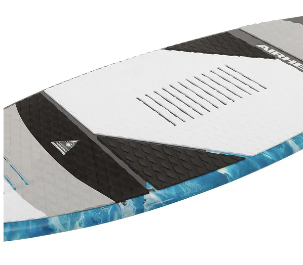
Inspired by the paintings of Daelyn Marie Sigman, I chose to work with the artist and incorporate her painting into this board. By cropping and sizing the image in different ways throughout the board, I was able to achieve a “wave” effect that mimicked water. We named the board Lake Effect after this water-like pattern. Daelyn’s original piece featured purple and pink hues, and with the artist’s permission we changed some of these traditionally feminine colors to a more gender neutral palette.
I chose gray and white hues for the padding on the board as to not take away from the intense colors and textures found in the painting. As for the cut lines, I worked to find the balance between visually appealing, but still functional for the rider. Overall the board was a success and was released in the Summer 2020 line.
solution


let’s make
things official
Ready to get started?